Are you looking to change the mood of your spaces? Color is a powerful design tool that can make rooms feel smaller or larger; support calmness or stir creative juices; or create the vivid recollection of a particular memory or scent.
What’s the best way to leverage color in your home renovations?
First, consider the primary function(s) of a space:
- Will it be a gathering spot for multiple people or a quiet space for one person?
- Is it a place where you’ll host guests, create works of art, do household chores, or retreat for a good night’s sleep?
Next, plan the look and feel of the space:
- If you’re remodeling a home office, chances are you’d like to feel determined and focused.
- If your profession includes devising ad campaigns, you might wish to foster your creative side.
- If you’re a yoga instructor, you’d likely want a calming, soothing space.
Finally, think about the big picture:
- Understanding the powers colors inherently possess is valuable for everyone who’s remodeling their home.
- By establishing clear goals for your space and how it relates to the rest of the home, you can use color to alter and enhance your overall experience.
A Selection of Colors from in Cornerstone Remodeling’s Projects >
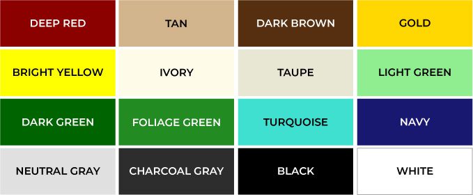
- DEEP RED – Robust like your favorite wine: elegant and refined, offering a rich and cultivated feel.
- DARK/BRICK RED – A more earthy tone of red; think of a brick that’s used in building or construction. It conveys a sense of strength, sturdiness, and durability.
- TAN – Rugged and rustic. Tan tones reflect the woodsy feelings in nature.
- CHOCOLATE/DARK BROWNS – Rich and robust, like what you look for in good chocolate and coffee. This darker tone can be used to inspire a sense of being grounded, rooted, and supportive.
- GOLD – This luxurious and expensive-looking color is used in many applications for expressing value and radiance. Think bling! A note of caution: it can become gaudy if overused.
- BRIGHT YELLOW – A cheerful shade. This color is lively, and stimulating. Sunshine and joy radiate and promote positive energy. The downsides: it can provide negative feelings of betrayal and hazard in certain circumstances.
- IVORY – Comforting and creamy goodness. Popular in the bridal world for its softness and natural appearance.
- TAUPE – A classical neutral with an organic feel. It has a compromising effect and is versatile in many settings. An overall practical color, though beware of its ability to become bland or tasteless in some situations.
- LIGHT GREEN – A calming and soothing neutral tone. Lightweight and not overbearing.
- DARK GREEN – Thoughts of money, prosperity, and tradition; this darker color tone promotes trustworthiness. It can also stir up images of forested and wooded areas.
- FOLIAGE GREEN – Nature and life. Balance and harmony. This tone is about new beginnings, restoration, health, and fertility. Many connect it with environmental awareness.
- TURQUOISE – A compassionate and protective color. Reminiscent of oceans, sky-scape, and tropical surroundings. Promotes faithfulness.
- NAVY – Provides credibility; it’s strong and reliable. Navy may help concentration and clarity – making it a beneficial color in office settings. On the negative side, it can foster the feeling of being distant and melancholy.
- NEUTRAL GRAY – Grays have become a popular color in home decorating because of their ability to play well with others. It has a classic and sobering effect. Like black, it has a timeless feel.
- CHARCOAL GRAY – The darkness lends to being accountable and professional, even sophisticated. A highly mature color. On the negative side, if not used correctly it can become dull and detached.
- BLACK – Elegantly sophisticated, it creates mystery and magic. Popular in strong modern settings. Can portray an expensive and invulnerable quality in your space. Be careful not to tap into its sinister or mourning side.
- WHITE – Arctic, airy, and clean. Provides clarity and simplicity. Be wary of overuse – as it can quickly become cold and sterile.


